SIONG CHIN > PORTFOLIO > BLOG > SAY HI
User Interface :
Laplink Everywhere |
Laplink Toolbar |
PCmover |
PCsync
Web :
Roam Mobility |
Laplink 25th Anniversary |
PCmover
Print :
Roam Mobility |
Gold08 Packaging |
Laplink Christmas Card |
Sam Taylor Book Cover
Identity :
Networks For Change |
Roam Mobility |
ACE |
Northern Lights

OVERVIEW
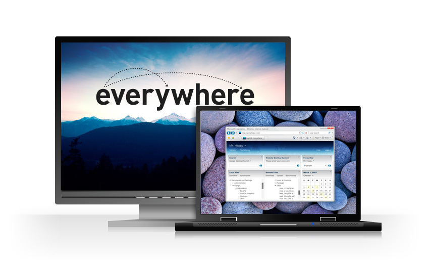
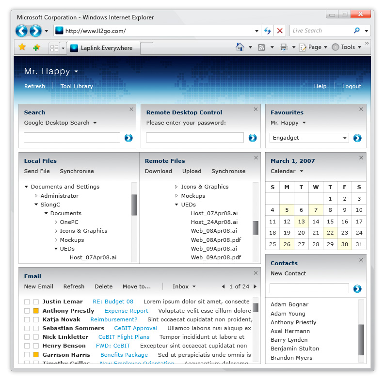
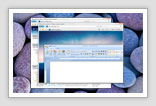
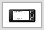
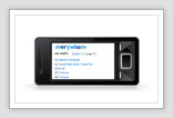
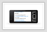
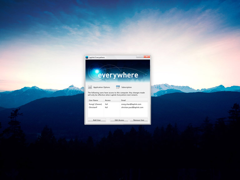
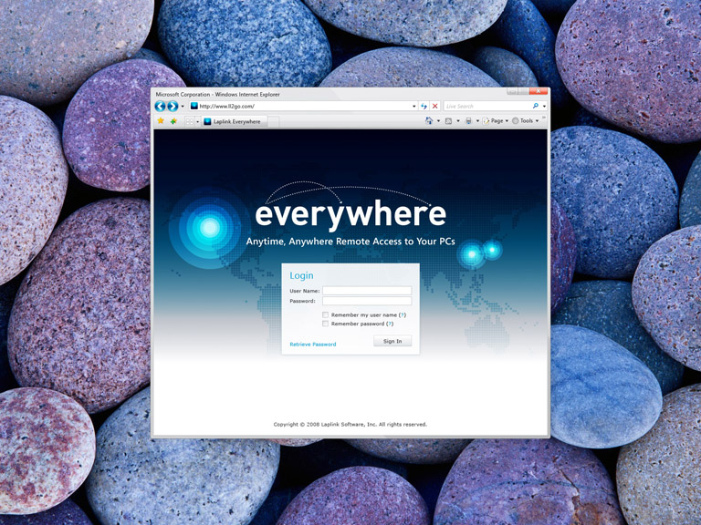
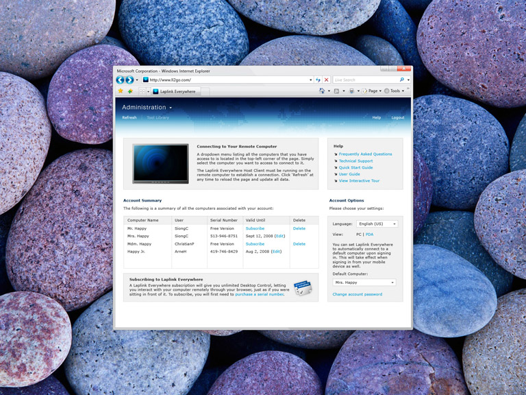
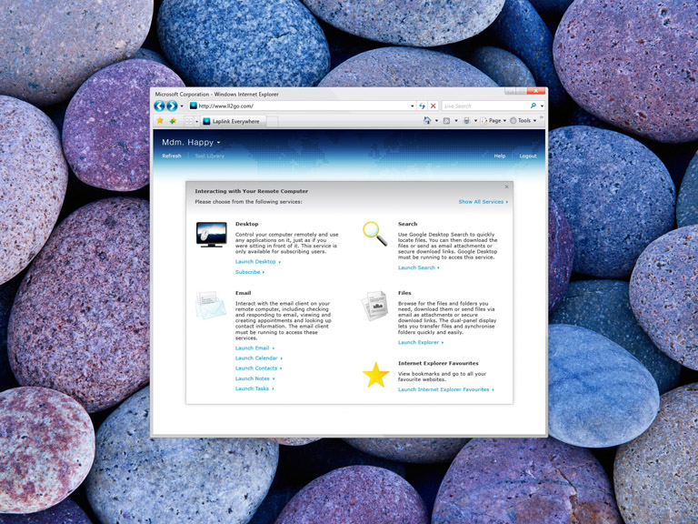
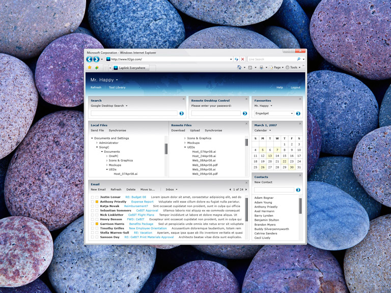
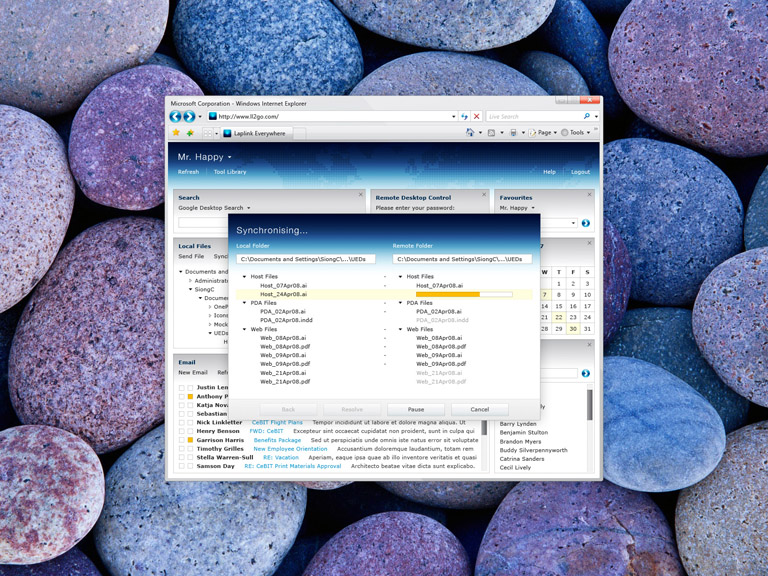
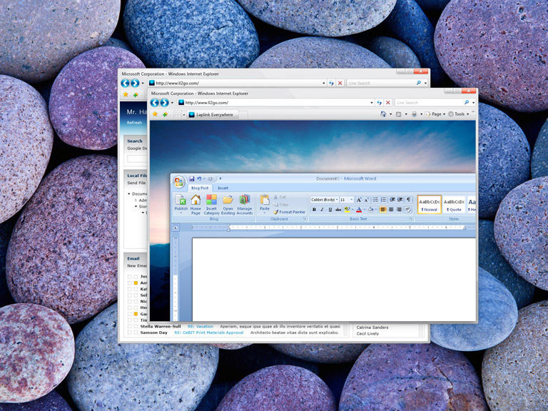
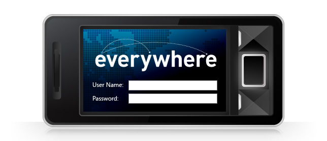
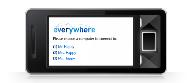
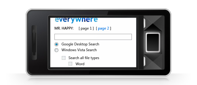
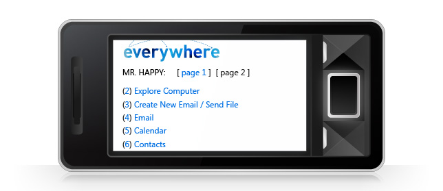
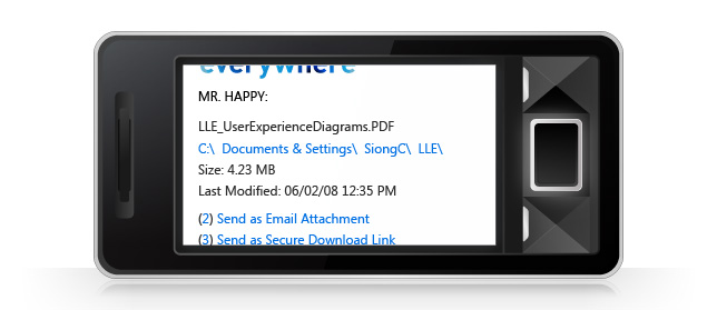
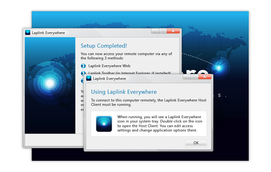
Laplink Everywhere is a desktop application that, when installed on your computer, allows you to remotely access it from anywhere via three different types of connection methods: a dedicated web portal, a browser toolbar (Laplink Toolbar) or through any web-enabled mobile device. There are three components to this application - Laplink Everywhere Host Client, Laplink Everywhere Web Portal and Laplink Everywhere Mobile (Laplink Toolbar was developed separately). Each of these components require user interfaces that are focused on efficiency and ease of use.
 |
 |
||||
 |
 |

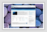
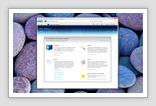
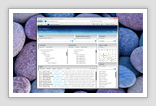
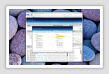
USER INTERFACE
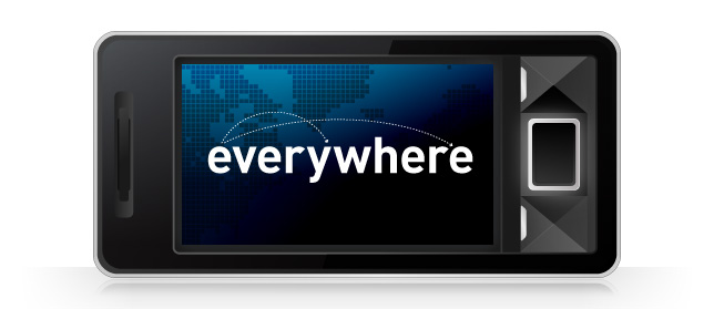
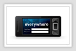
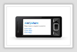
Laplink Everywhere Mobile is built to offer users remote access and productivity on-the-go. It is essentially a streamlined version of Lapink Everywhere Web Portal but optimised for the mobile phone. Due to the highly interoperable nature of each of the four components, extra attention was given to the design of a typical user’s experience when using Laplink Everywhere. This encompassed the process of creating and managing an account, installing the application, establishing remote access for multiple computers and devices, documentation including User Guides, Quick Start Guide and Frequently Asked Questions (FAQs). Along with the uniformity of all visual cues and textual references, the production and development aimed at creating a seamless user experience that begins when the user first learns of the product to the usage of it.
 |
||||||
|
|
|||||
|
|
|||||
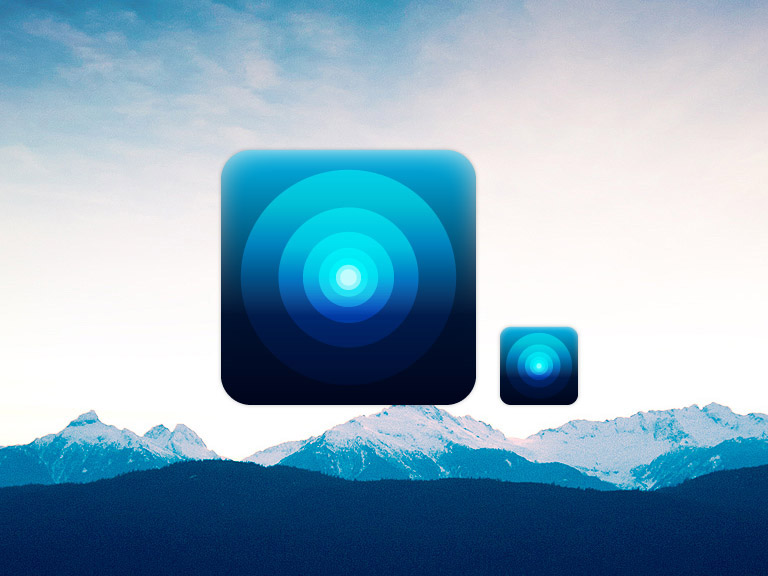
ART DIRECTION
An analysis of competing products reveals that art direction is not a strong focus in the market. However, to help establish Laplink Everywhere as a worthy competitor and also a complementary product to Laplink's ecosystem of offerings, it needed to have a strong identity and voice of its own that builds upon Laplink's visual vocabulary. This was reflected in the design of the application icon - using a professional and confident colour to illustrate a straightforward idea. The same idea was carried across all other artwork.
Copyright © 2009 Siong Chin. All rights reserved.